Have you ever been browsing a site and tried to do a common action such as Copy+Paste or right click on what appears to be a link to copy the location URL or tell the browser to open it in a new tab only for this simple action not to work as expected! Frustrating right?
I had this exact experience recently and while I usually would just cast it off as a minor annoyance not worthy of any further investigation this time was different. After an accummulation of many small pin pricks like this over the years "my dam had burst" and this encounter finally sent me over the edge. These user experience attrocities happen far too frequenetly nowadays in my opinion.
This problem isn't a new one. You can find examples like this one from 2014 highlighted by Nicolas Miller as the practices goes far back. However, these infractions used to be reserved for sites rarely visited which typically had downright terrible UX overall but whose behaviour was excused by users due to providing some unique service (such as banking or gaming) or content access (such as pirate or pornography sites). Now, unfortunately, what used to be a technique employed only by these previosuly mentioned niche or fringe sites who use JavaScript and or sometimes obfuscated code deeply nested in many blocks and iframes to try to dissuade and even block standard navigation or otherwise prevent downloading of content is now commonly being deployed against users even on traditional everyday sites such as modern banking applications, e-commerce shops, newsletters and by Big Tech companies whose services are rightly expected to provide great design and UX and who should really know better. While this scourge is nowhere near as bad as the privacy invading trackers and other advertising related malpractice in common use today it should nevertheless be stomped out just as vigorously.
To see why let's look at an example of how this manifests itself for a typical user. Below is a newsletter page generated by Substack.

The page displayes news item cards with some meta information such as a header and summary. When a users' mouse hovers over a card it is highlighted as shown below.

Given the above behaviour it would be reasonable to assume from the perspecticve of a user that either the card is a link or at least one of the meta sub-elements on the card is a typical web page link. This is useful as there are standards as well as closely followed conventions on how links are to behave and the actions that browsers will support on link elements. This is web navigation "muscle memory." In this particular case when the card is clicked substack loads the article and replaces the window with its contents. The downside here is that when on the post page the user doesn't have a quick way of going back to the news listing with all the posts because selecting the back link on a post page brings up the "signup" page which while not desirable from a users perspective is desirable from substacks viewpoint. The only way to get to back to the full post listing is to select instead the authors avatar on the post page which is whether intended or not a non-obvious behaviour or at the very least a clumsy way to navigate.
So discovering this a user in all their brillance may decide to skip the clumsy navigation and poor design and just open many links in new tabs to make their life efficient while on a newsletter reading binge. Let's see what happens when they attempt that.

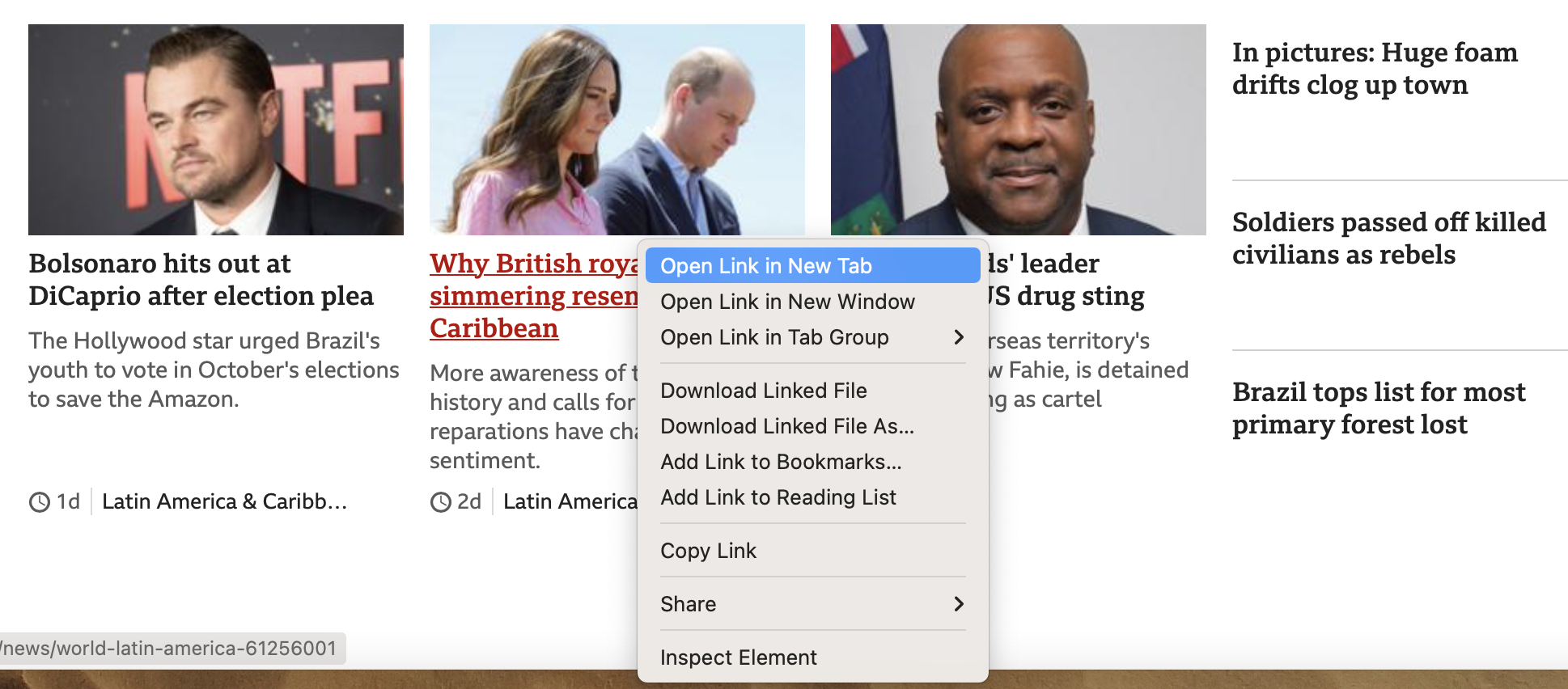
Oh no. The user is prevented from opening up the post in a new tab. This is strange as a link usually has that option as you can see below from a normal link shown on the BBC News website.
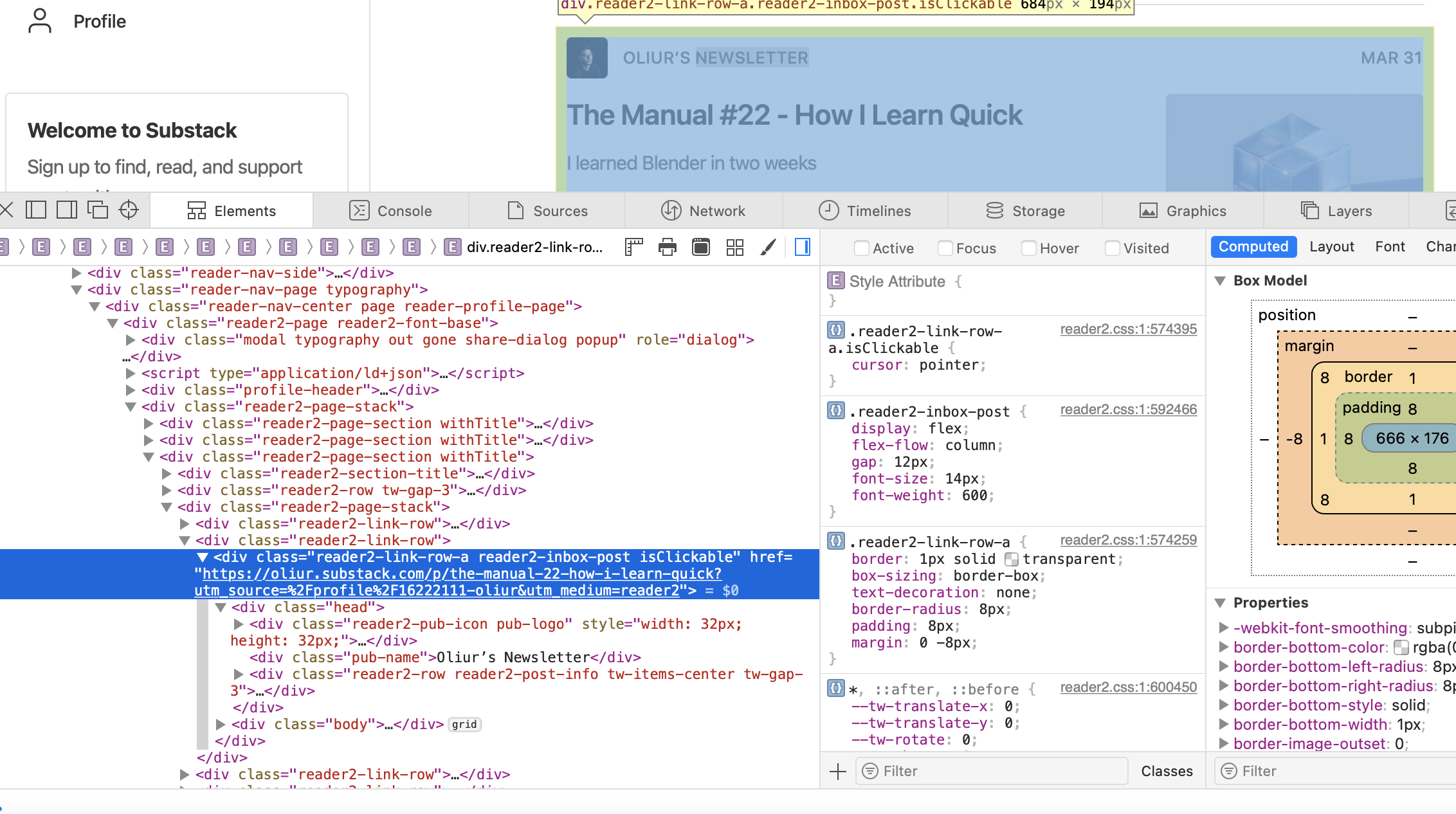
Wait. Why is the substack link different? What's happening? Let's take a look at the code inspector.
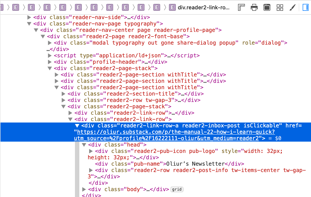
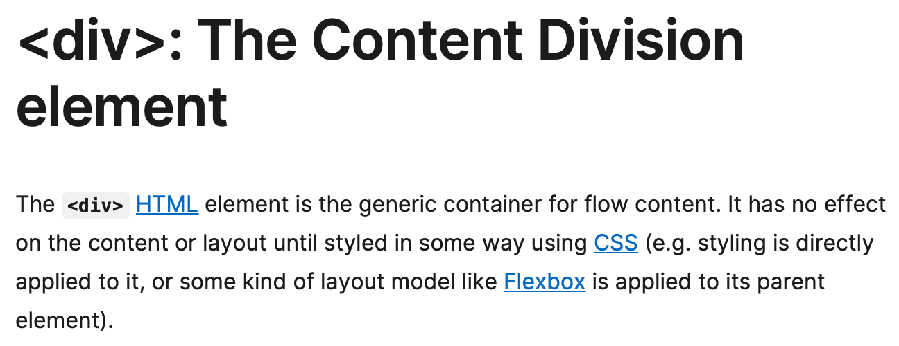
As it turns out our link is not a link at all. In HTML a link should be represented in the body by an anchor <a> element but instead substack is using a <div> element with an href property! Don't believe me? Don't take my word for it alone. Look at what MDN says.
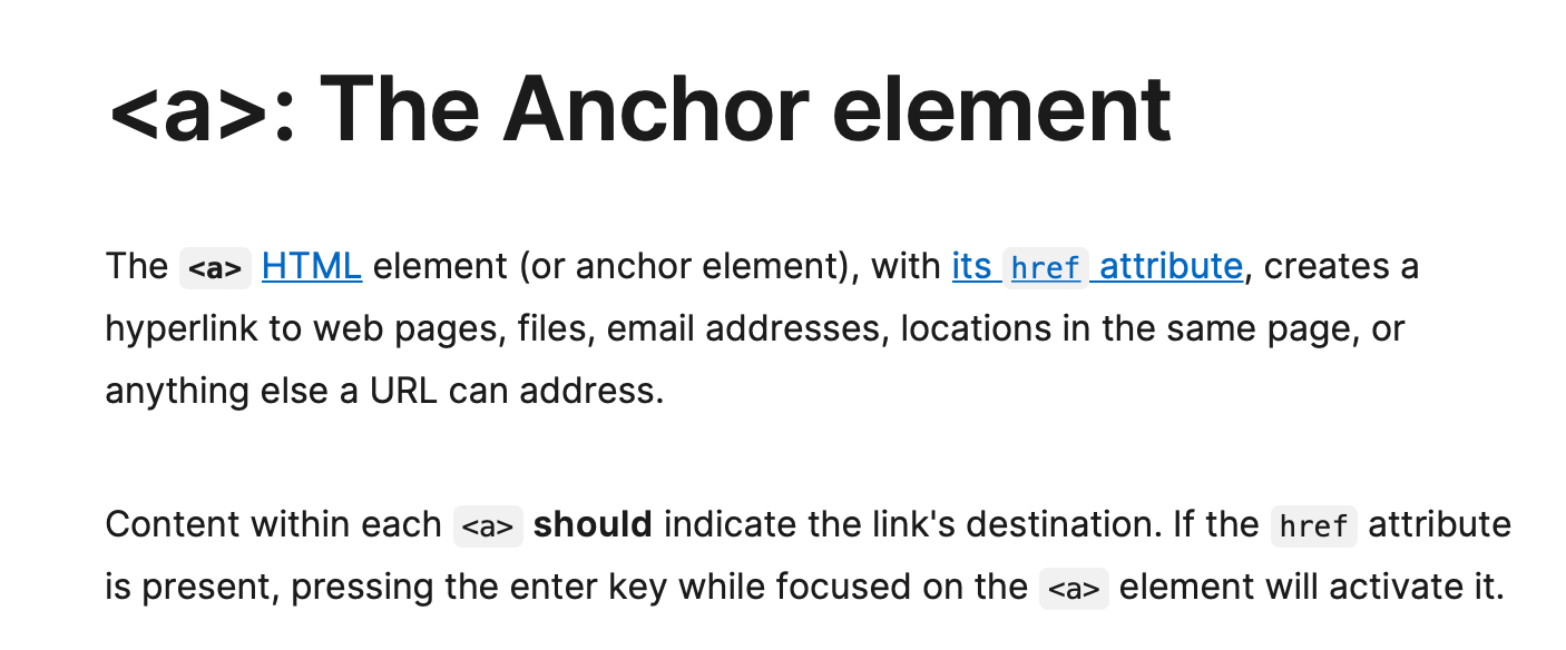
Below is the purpose of a <div> element.
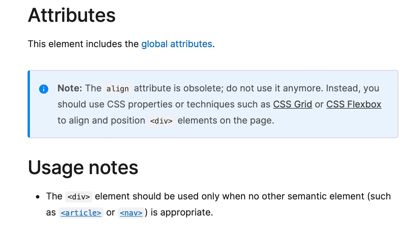
Also note that there is no hyperlink reference or "href" attribute either for a <div>.
Therefore, subtack is employing some custom JavaScript code here to intercept the mouse click event to trigger the page nagivation when the card is pressed to mimic the link behaviour since the browser would otherwise have no way of knowing that it should treat each card <div> as an anchor.
What this means is that the only way for a user to achieve the action of opening a card in a new tab (which would be the normal option available to them in the optional/alt/right-click menu) behaviour is to use the code inspector and select each card div and copy the url reference found in the "href" attribute and then manually open a new tab window and paste the URL to navigate. So basically, to avoid the initial clumsy experience you would have to do something even more clumsy which requires advanced knowledge in the first place. That's a lot of work. Clearly this interface is designed to frustrate advanced users by preventing them opening links in tabs. I say clearly here as it is obviously a deliberate decisions since it is extra work for substack to implement and maintain this non standard behaviour to begin with.
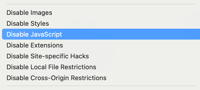
For other sites that employ even more advanced techniques the number of standard interactions changed may even be worse and they can even block simply actions as copying and pasting text on the site. To circumvent these the user may have to enter special settings in advanced option pages or in the case of Safari go to the Develop menu and disable JavaScript for all sites like the below to temporarily allow the action.
Breaking standards and conventions in this manner is ridiculous and user hostile. Users should not be forced into having workarounds because of unnecessarily implemented non-standard navigation that prevent normal browser operations. In this open letter to all web developers I am imploring you to please stop this nonsense.
Written by Nneko Branche.