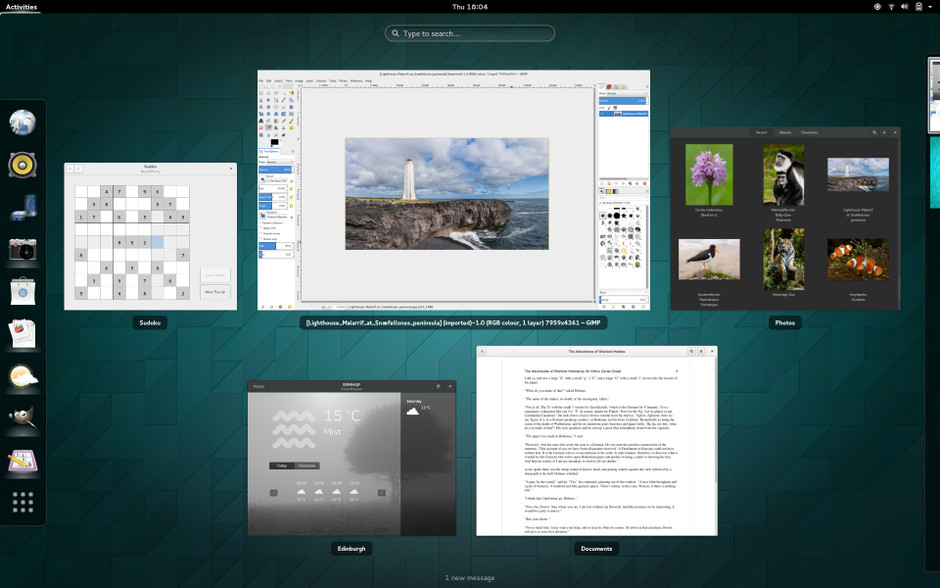
Yet another incremental release from the venerable Gnome Project that continues to evolve the desktop state of art by one pixel at a time. This update brings the desktop closer to delivering a Beautiful yet Functional; Powerful yet Simple system. It is basic enough to cater to a five year old while still being capable enough to be at ease with the workflow of an experienced Linux guru. Yes, we like it! The desktop is still an exciting place. However, that doesn't mean team Gnome should get complacent as there are still a few lemons left.
Let's take a closer look and give this update a proper review but first...
A bit of history
Minimalism and elegance have been the ethos of the Gnome Project since the radical departures that marked the debut of the 3.0 series. Spurred on by the drive to mirror mobile like simplification and ease of use in the context of the desktop computer the development team decided to make sacrifices. Unfortunately, those initial 3.0 era releases did not get the balance right as there were too many compromises and not enough gain for most people. The cuts went too far in the "dumb it down" direction forfeiting common sense and utility in the process.
Consequently those early experiments weren't a success. Comments like the below were echoed widely.
The developers have apparently decided that it's 'too complicated’ to actually do real work on your desktop, and have decided to make it really annoying to do.
...
This 'users are idiots, and are confused by functionality' mentality of Gnome is a disease. Linus Torvalds (2011).
What followed was a massive exodus of distributions along with the abandonment of Gnome by quite a few users who were in search of something more familiar or who just wanted a more keyboard friendly and arguably more productive user interface and experience.
Notwithstanding the early misteps I was one of those who chose to stick it out. I enjoyed the refreshing new direction and look but also had to constantly adjust my routine while hoping that the developers would come good on their promise of a better future. It was painful and frustrating especially during the 3.0 - 3.4 period. Luckily things started to change for the better with 3.6 and with 3.8 and beyond they haven't looked back.
The user did matter afterall and him/her wasn't an idiot. The project team learned and they started to listen. Obviously failed ideas were reverted. On the technical side speed and power was brought by the GJS engine which showed that widgets and a graphical shell can be brought to life in Javascript. It was pretty, quick and powerful but most importantly fast to develop and easy to change (if you were a developer).
On the frontend users were given the Gnome Tweak Tool. You could and should indeed have shortcuts on your desktop if that floats your boat :). Finally, extensions started to appear that solved varying types of niggles and even improved the environment in unexpected ways. There was a light at the end of the tunnel. The community started to grow again. Gnome was alive!
Release 3.14 doesn't disappoint and continues in the iterative vain with a series of small improvements. We are treated in 3.14 to a smooth and surprisingly more polished interface with hardly a regression.
Introducing you to GNOME 3.14
Video by [GNOMEDesktop](http://www.youtube.com/channel/UCH9zoXlRn8iiaiSmuazAFZw).Whats new?
Seeing is believing right? So a video tour is needed for the feature demo? Here you have one.
Video by [WebUpd8](https://www.youtube.com/channel/UCPgXPeJo-J85xEqpI_HmA6Q).Who's got a new look
Adwaita
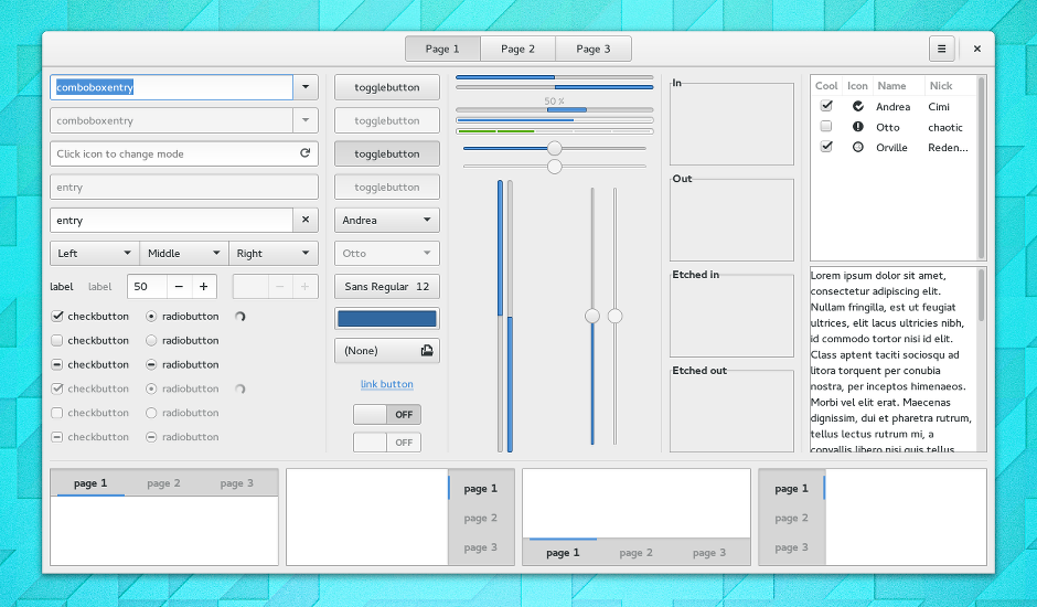
The Adwaita theme got an overhaul in this update and continues to trim down. Overall the aesthetics were integrated well and maintained the original design vision but got more conservative with how it utilized the screen real estate.
Weather
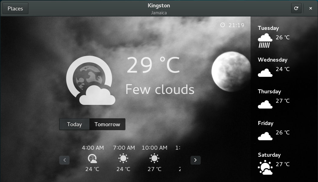
A compact interface that delivers all the weather information you need to know for the entire week at a glance in a single window.
Evince the Document Viewer
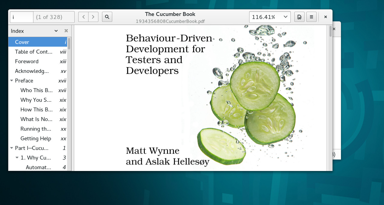
No clutter. No bullshit. It takes the interface out the way so you can put all your energy in and focus on reading your document.
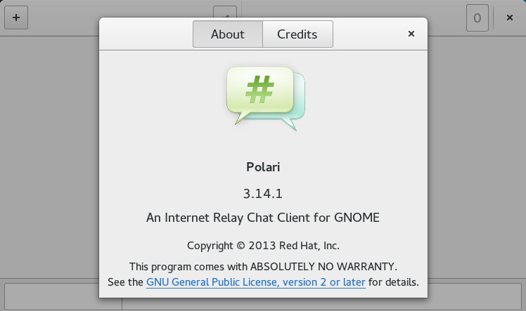
Polari for IRC
Actually released in 3.12 but still worth a mention.
Beyond the aesthetics. Here are the other things that also got better
Transitions and Animations
Smooth transitions executed by animation between applications and other interface elements are a staple of any modern Operating System (OS) and for that matter any graphical user interface today. Implementations of this design principle can be seen from the Web to the Smartphone. The desktop OS that makes the best use of this is Apple's OS X who in my opinion pioneered the contemporary techniques of bouncing icons, fading, shading in an out and warping windows to demonstrate visually a change of state in a subtle way that created a visceral sense of pleasure.
Even Windows the bastion of the mediocre and the enterprise knowledge worker caught on to the benefits. Not to worry though. Linux was not left behind and it got it's first incarceration of this wonderful trend in the form of Xgl followed by Compiz and Beryl thanks in large part to the work of David Reveman in 2006.
Who remembers these days?
Video by [William Söderberg](https://www.youtube.com/channel/UCtMtqgCHnI7iXdkXywygtPA).These original projects have largely gone defunct as the other Window Managers incorporated compositing engines into their core and no longer needed the additional addons. Gnome was no different and it has its own compositing infrastructure which was first introduced with 3.0. Compiz which demoed on Gnome now only lives on through maintenance updates provided to Ubuntu's Unity.
However, one thing was lost during the transition...it was the effects! They were all gone. It was boring and that fun exciting feeling people had just moving windows went away with them. What's the point of compositing and requiring 3D hardware if you don't plan to use it?
So now the effects are back. Thank God! Our Windows still don't wobble or blow up in flames. Nevertheless, that joy is now back again and animation is now front and center at the core. I am sure the crazy stuff will eventually be found in those extensions.
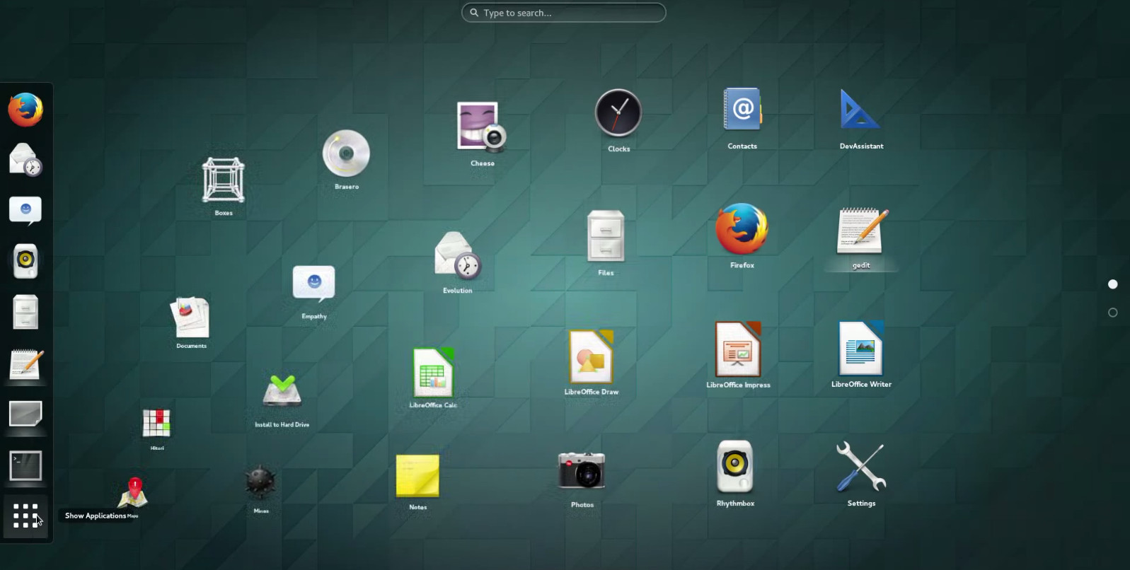
Animations are everywhere. Even in the shell
Video by [Gnome TV](http://www.youtube.com/channel/UCIcFK6qYHq7ip1kQGBPLVgA).and our windows too.
Video by [Alex Bill](http://www.youtube.com/channel/UCs4TAHi6CfpAlPPZYBcJzKg).Updated Applications
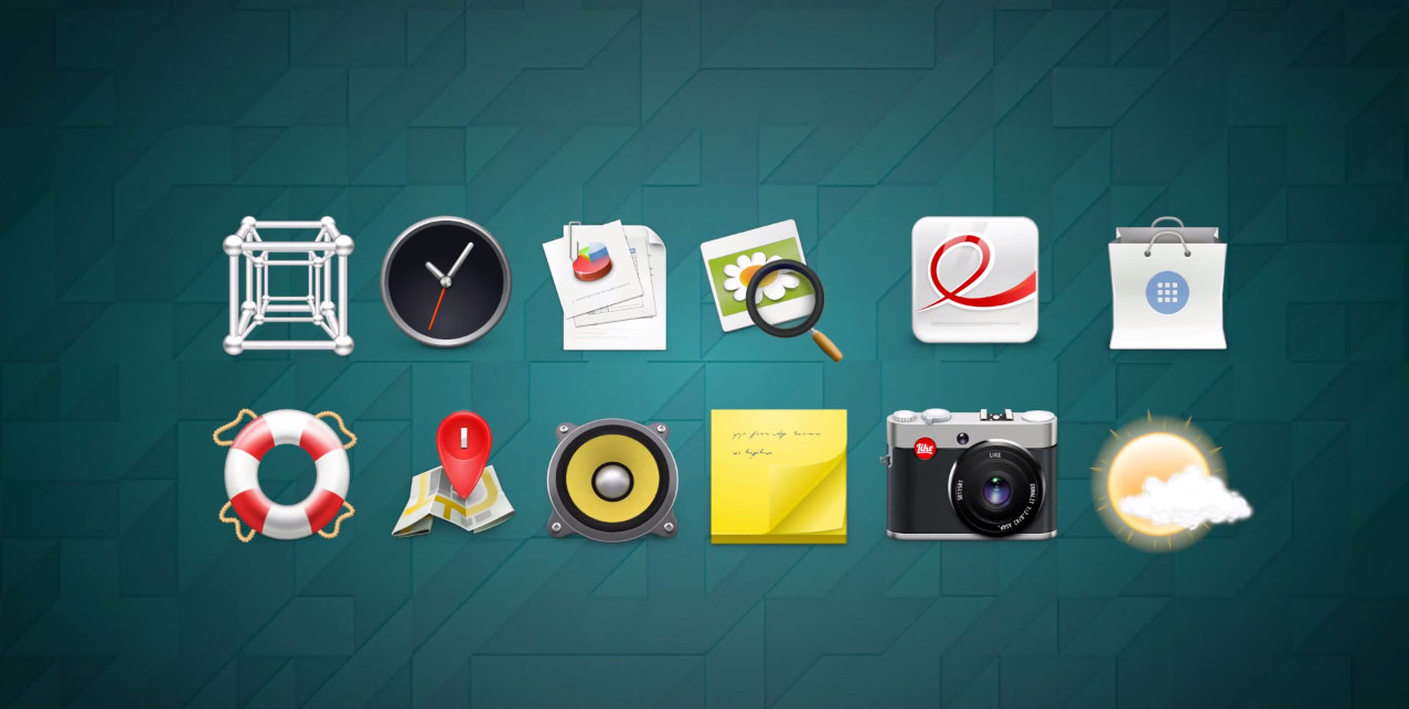
As is customary some applications saw some major changes for this release. The snapshot above summarizes the primary ones affected.
New Search Providors
You can now do calculations from the Activities overlay. Logarithms and Sine functions included.
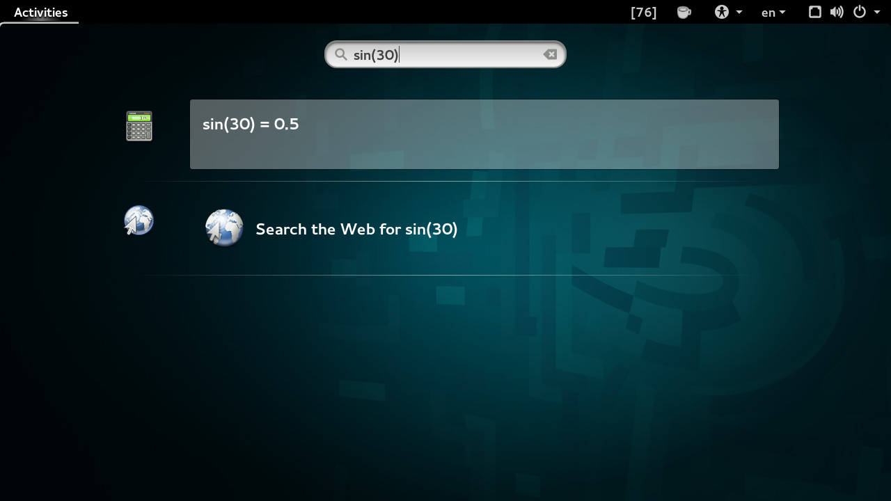
Travelling and want to know what the time is? Just search for the city.

Boxes
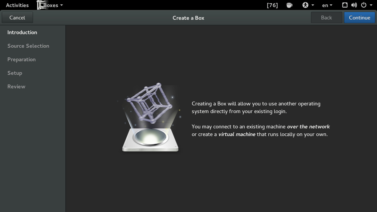
I must admit that boxes has been out for awhile but I only recently tried it. I was pleasantly surprised by what I found. If it continues to improve with each new release and they do some integration with docker in the near future we may not need Oracle's VirtualBox.
New features included in this release are the ability to download images from URL's and automatically start the VM installation.
WiFi Hotspot Sign In handling
Gnome will now automatically launch the login page when users connect to a WiFi hotspot that requires authentication.
Multitouch Support
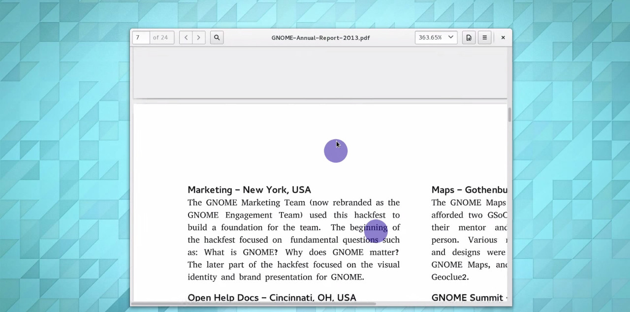
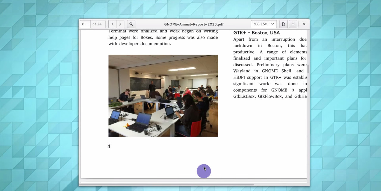
Pinch to zoom and two finger scrolling have now been integrated into Evince and Eye Of Gnome.
Improved Multi Monitor Support
Gnome remembers which windows were assigned to which monitors and it restores your Windows to the right screen after a disconnect and reconnect.
Improved High Resolution Display Support
Ultra high DPI and resolution support was introduced in 3.12 along with fixed scaling of the display. This has been improved upon with more flexible scaling which includes the ability to independently scale fonts as well.
Online Accounts
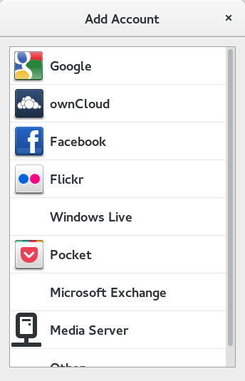
Support has been included for more online services. Synchronization continues to be smooth and seamless. Certainly the best on any Linux Desktop.
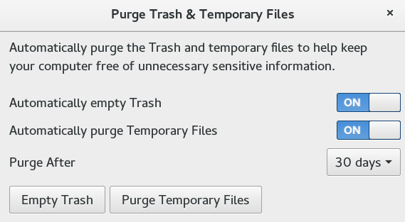
Privacy Controls
Today our privacy is constantly being invaded and challenged by the connected and cloud centric world that we live in. That is why it so refreshing to see an environment behave responsibily and give back some control to its users.
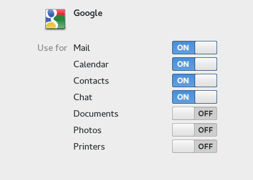
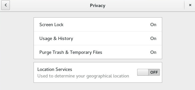
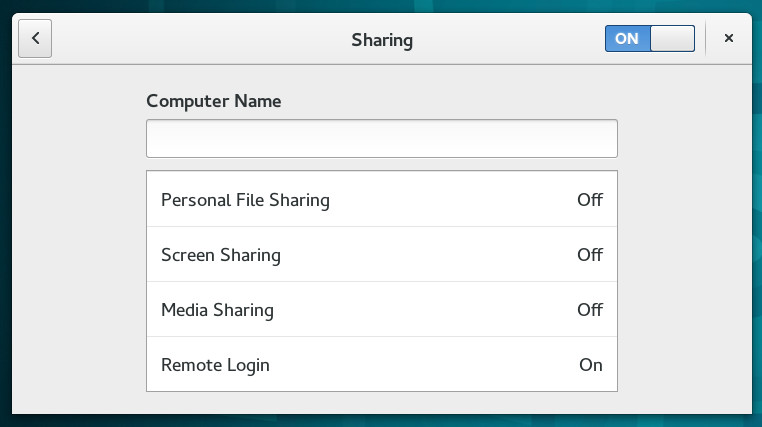
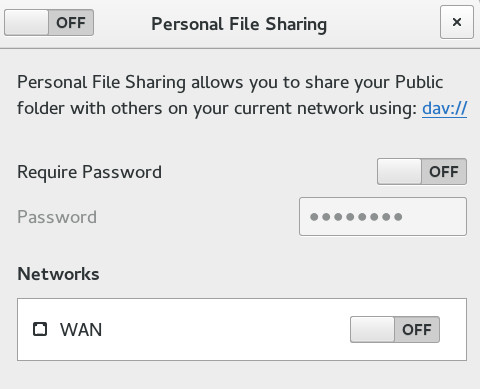
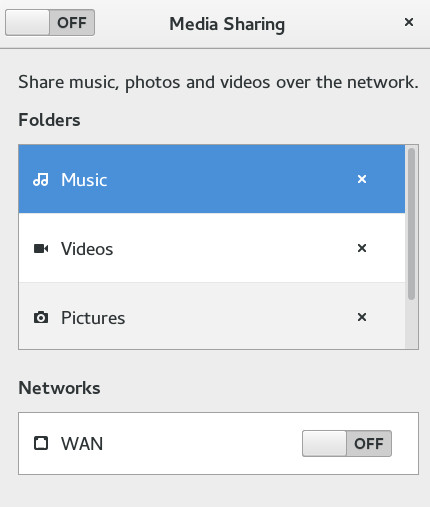
With the ability of cloud services to access all the data on your workstation through the Online Accounts features there needs to be baked into the system a counterbalance as too often people are unaware or are sharing more than intended. For Gnome these counter measures come in the form of the privacy controls settings and the fine grained sharing options that allow you to select what category of data gets exposed.
Selectively share with Online Services.
Privacy Settings.
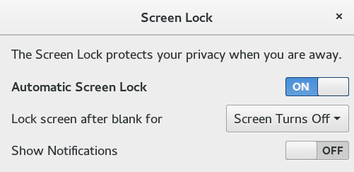
Control what notifications get displayed on the lock screen.
Clear usage history information.
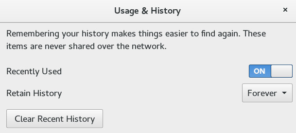
Purge temporary and deleted files.
Even more sharing options without losing control

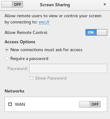
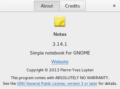
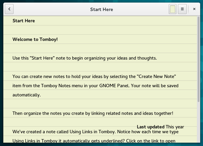
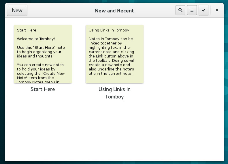
Notes
Debuted in a prior release it looks promising. I didn't have time to test run it properly but I liked what I saw.
More Games
Mines and Sudoku received updates while premiering in this release is a new numbers game called Hitori.
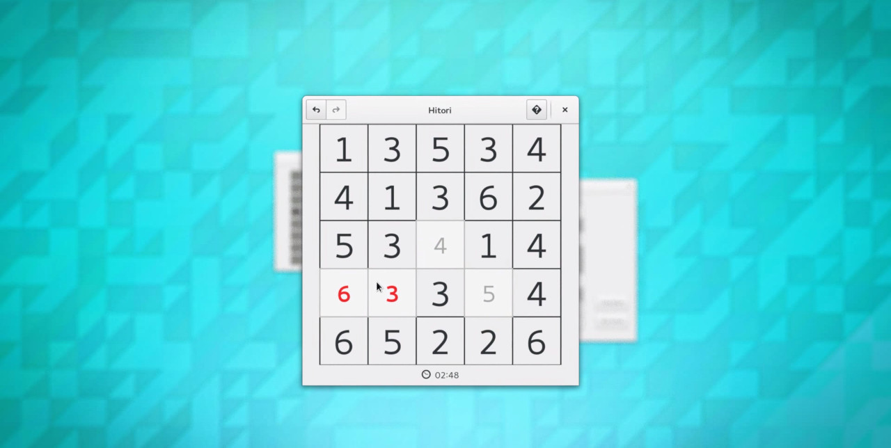
Some goodies for the developers
Glib now does more unicode.

gtk version update
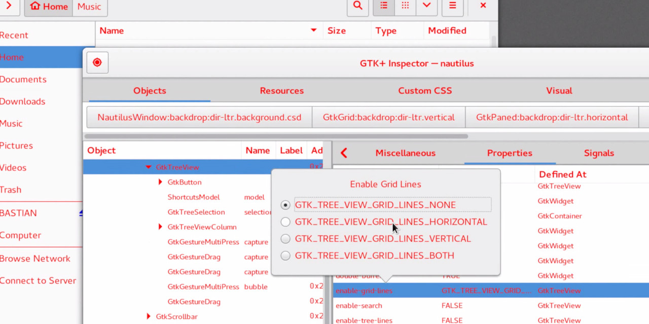
GTK+ Inspector
Stability improvements for Wayland

Where Gnome is wanting. Areas that still need improvement
While this release added a touch of polish on an already solid base there were still some features that need improvement. Let's hope they get the required attention in time for the next release cycle.
Extensions
They continue to be broken with each release. Often times all that is needed is a metadata update to include the version number in the json file. Nevertheless, this framework needs to be fixed and old extensions should be expected to continue working unless the APIs change.
Validation can be disabled by adjusting values in dconf or doing the below with gsettings from the commandline.
gsettings set org.gnome.shell "disable-extension-version-validation" true
Really though, what we want is not to disable extension validation instead we need it to be more intelligent.
Inaddition, extensions do not auto update or check for new versions of themselves. Even with the tweak tool you have to navigate to https://extensions.gnome.org to manually update them. Improvement is needed here as extension form a critical component of each users workflow and productivity is hampered when they become unavailable.
Nautilus
The organization of the interface has definitely been fine tuned and it's still a very pleasing file manager to look at. However, it gets more and more keyboard unfriendly with each release. This is the one regression that is still to be fixed.
For me its weakness and loathing of the keyboard becomes apparent when engaging with the search and trying to select items in the current window by file name only.
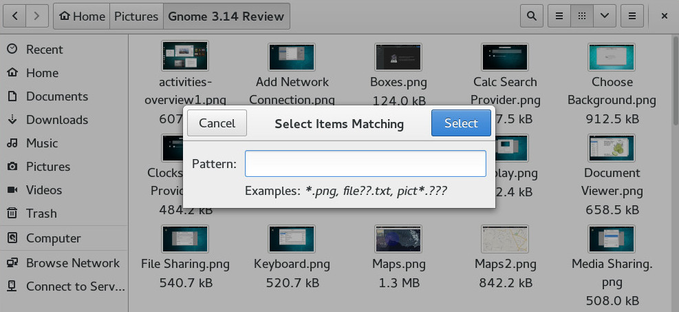
Sure you can use a special shortcut like in the above and type a regex but this is slower and time consuming. I simply want it to search the current working directoy when I type names and hop from file to file like in every other Operating System. System wide search is useful when you don't know what your looking for or where it is located but what about those times when you do? For those cases you just need to jump to it faster not search for it all over again. The interface should allow you to do both.
Icons
I like Gnome's icon theme but many people are starting to think that they look dated. Time for a refresh? Looking like its that time to give the icons a Google Material Design like or iOS flat design style revamp.
Videos formally known as Totem
They did a nice job around 3.12 to update the look and feel. However, since then its playback performance has lagged. VLC is now my default once again.
Maps
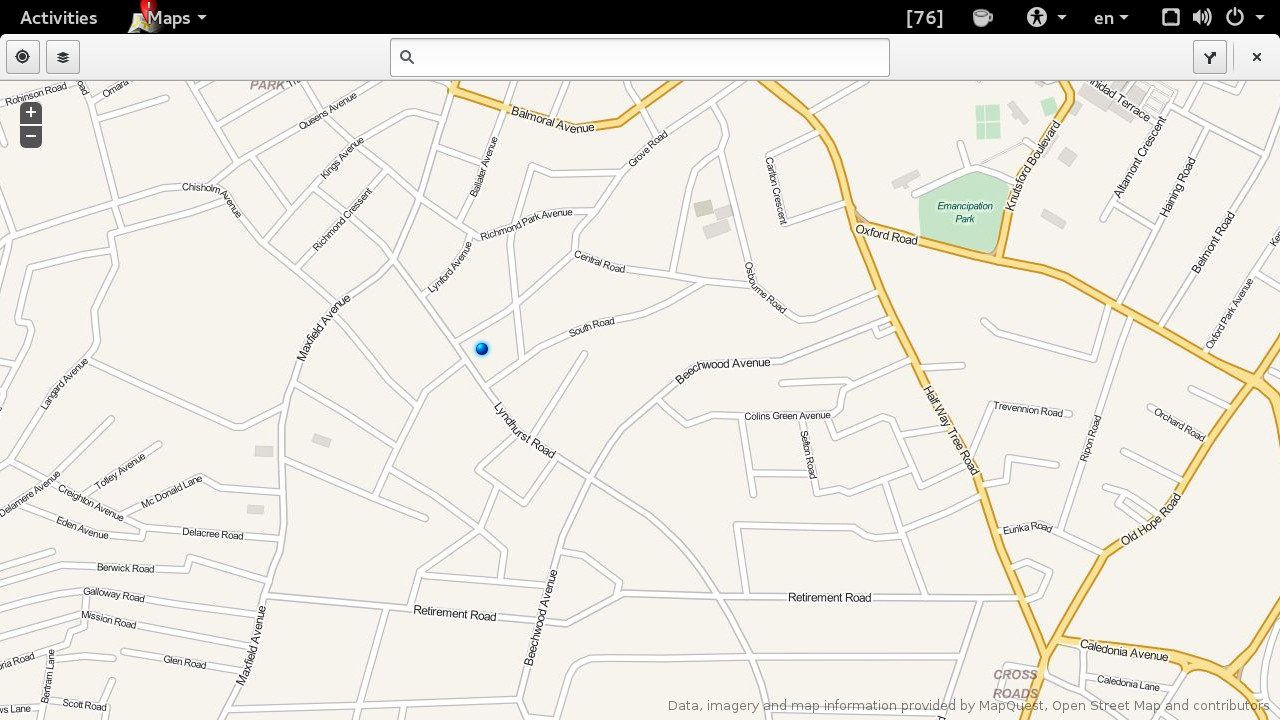
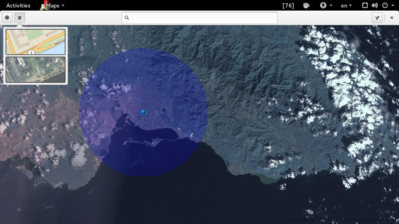
Great that this was included but it does not have detailed satellite images of many countries outside North America and Europe. I guess we can't blame them for this part totally since Gnome is not a commercial product. The one good thing is that it now has navigation support and route planning thanks to GrassHopper
The Lemons!

Photo by Andrew Comings
Music
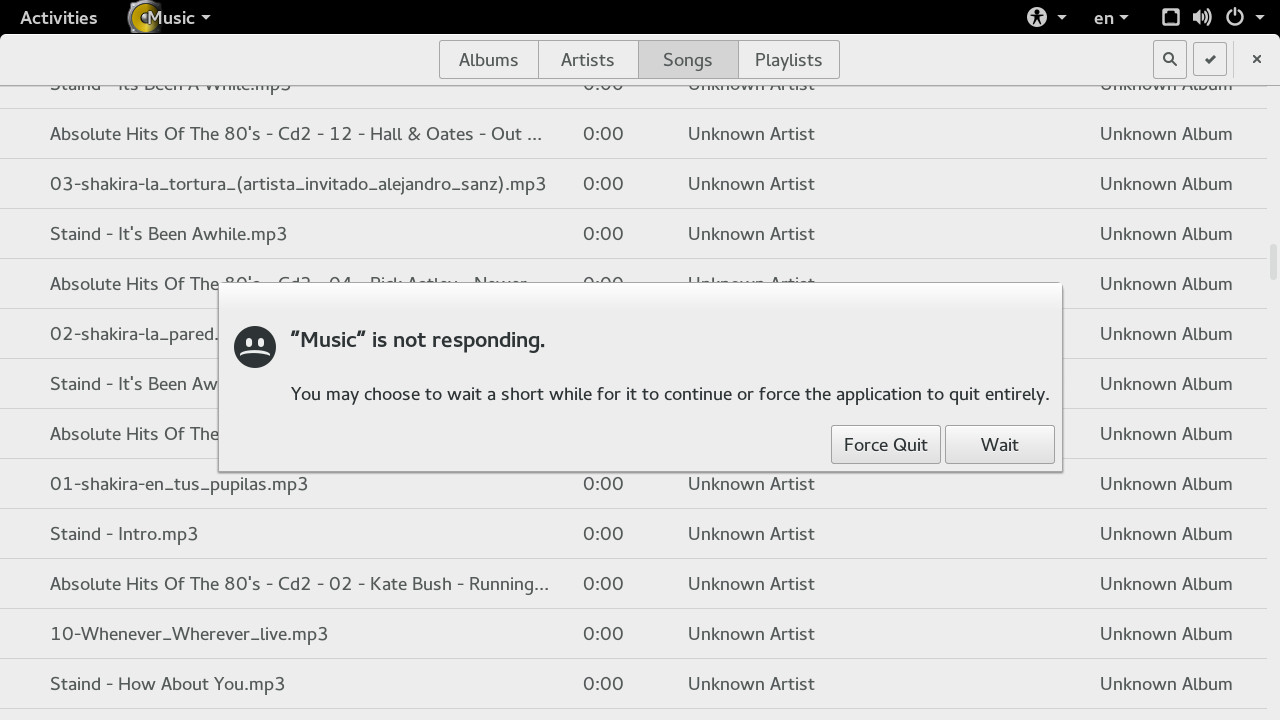
Sure this application can be beautiful. Just one flaw. Your library needs to be small and I mean real small. Wait, hold on, this is 2014 which means if you actually even bothered to download songs and have a music library instead of streaming using services like Spotify or Pandora by definition you don't have a small collection. Upgrades are supposed to be better except this upgrade actually made this application even worse and it was already not stellar in 3.12.
Basically that means this application is useless right now. I am confident they will get it right in the future. Unfortunately, we live in the present and in the present it suffers from painful and endless mind numbing indexing, slows to a crawl, and then misses half your library. Not to mention the selective loading when you just want to browse through the library that it already indexed. Also it has regressed and does not utilize the folders hierarchy anymore to sort and label items when metadata is missing.
In summary stay away from this application as it is barely Beta software and most likely late Alpha. It's performance is just unacceptable when there are more capable and feature rich alternatives like Banshee and Rhythmbox out in the wild.
Photos
Yes, this is a lemon too. Great online sync abilities and a nicely put together interface but suffers from the indexing problem as well. Even on a Quad Core processor with 12gb once you throw a few terabytes its way your likely to see this quite often
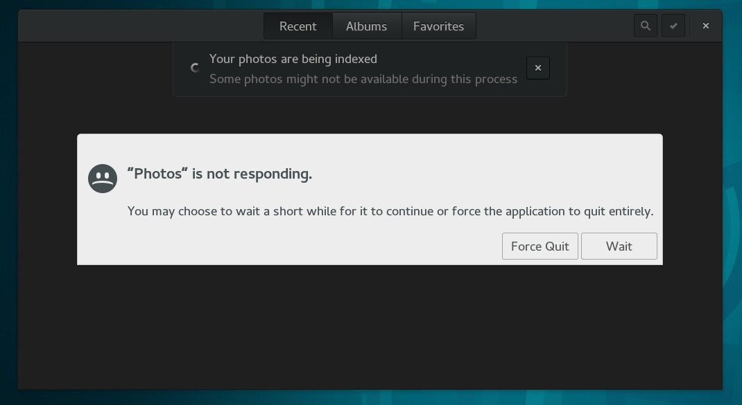
Otherwise it's good. It does need to fix is browsing behaviour though. Please developers, stop taking your ques from the Music app as that's bad since Music is all sorts of wrong.
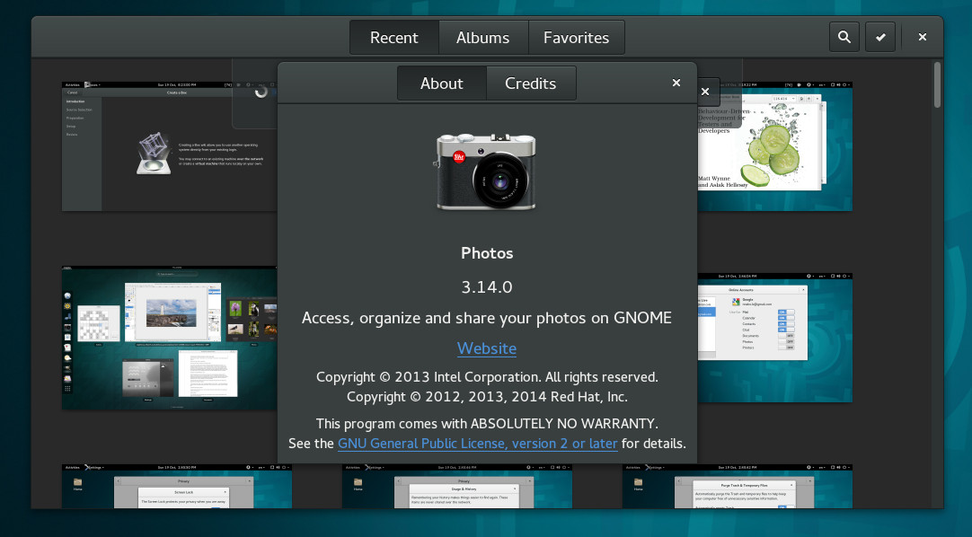
Tracker
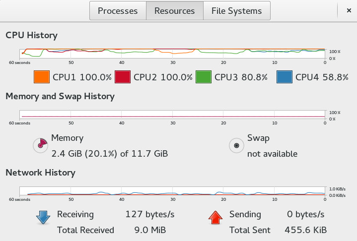
Oh the indexing service...I think the image says it all.
Final Thoughts
If you were disgusted by the arrogance following the initial 3.0 release and fled. Now is the time to give Gnome another consideration. As a user with an original preference for Gnome I can tell you that you are unlikely to find comfort in KDE land and there is little solace in the barebones desert of xfce. Comeback home. It's beautiful!
Gnome is back on track. Don't take my word for it. Take his.
I'm actually back to gnome3 because with the right extensions it is more pleasant.
Linus Torvalds (2013).
 Nneko Branche.